Comic Book Review: The Darkness: Hope #1 (One-Shot)
There is something wrong with the world and Hope Estacado, along with reporter Jake Meer, are determined to figure out what exactly is wrong. How does it fare?
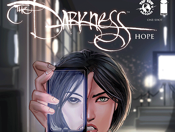
[easyazon_image align=”center” height=”500″ identifier=”B01DMFPG4Y” locale=”US” src=”https://boundingintocomics.com/wp-content/uploads/2016/04/51Tpe0pXj8L.jpg” tag=”bounintocomi-20″ width=”330″]
[easyazon_link identifier=”B01DMFPG4Y” locale=”US” tag=”bounintocomi-20″]The Darkness: Hope #1[/easyazon_link] is an out of continuity book providing us with a “What If?” moment. The book is also the result of Top Cow’s Talent Hunt with winning writer Charlie Harmon and artist Daniel Dwyer on creative duties.
The story for the most part is decent. Harmon introduces us to Hope Estacado right from the get go. He does a great job of making her relatable. She lives in a semi-cluttered, small apartment and is definitely not a morning person. Harmon even provides dialogue with Hope’s best friend discussing everyday topics.
The story really finds its legs during a crazed incident where a man throws a trash can through a window and shouts, “The stars are wrong. It’s all wrong.” Hope’s job as an investigative reporter is revealed and she sets off with her coworker, Jake Meer, to figure out why the stars have completely different positions in the sky than they are supposed to. The mystery behind why the stars aren’t aligned is compelling and you want to follow along with Hope to discover the answer. In fact, Harmon and Dwyer do a great job of foreshadowing the answer throughout the book
Her investigation has her follow-up on both scientific and human angles. The writing during the scientific follow-up is painstakingly terrible. Harmon forgoes any actual or even made-up research in his dialogue. Instead, he uses “Science jarble gooble.” It’s just awful to look at and takes you completely out of the story by breaking the fourth wall. It also ruins the emotional outburst from Hope, making it come off as contrived and completely incomprehensible.

Fortunately, that’s the only time Harmon goes completely off the rails with the writing. For the most part, it is rather enjoyable, although there are points that are superfluous to the story and character development that could be trimmed out.
Daniel Dwyer’s artwork is alright. The first image we see is extremely off-putting due to the odd proportions of Hope’s body. Her character is extremely long and a bit out of proportion. Dwyer is able to hide this problem by either covering up Hope’s legs throughout the rest of the issue or having her sitting down. He also struggles in a panel where Hope is fleeing from her co-worker. Her arms appear to be coming out of her back with her head focused in the foreground. It looks extremely painful and completely unnatural.
He does a really good job of instilling a creepy factor throughout the issue, especially during the foreshadowing dream sequences. Just seeing Hope’s face scream in fear can send a shiver up your spine. His splash pages are also solid and give the story a bit of an epic feel.
Chris Northrop’s colors are a little flat in some areas where they should be brighter. It drains emotion from the characters and the story. It loses some of the flair it should have. This is especially the case in flashback scenes. There are also pages where he chooses a background color that is very similar to what some of the characters are wearing and the characters get lost in the background.

The Verdict
[easyazon_link identifier=”B01DMFPG4Y” locale=”US” tag=”bounintocomi-20″]The Darkness: Hope #1[/easyazon_link] definitely feels like the first outing for the creative team. The book has a solid story, but it lacks execution with a number of flaws in the writing, art, and coloring. If you want an out of continuity Darkness story, this might be worth your time, but if you are looking for a solid one-shot, you should pass on this one.