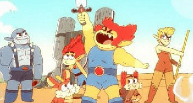
New ThunderCats Roar Looks Like an Abomination Just Waiting to Happen

Cartoon Network announced last week that the ThunderCats are coming back in a new animated series called ThunderCats Roar that will debut on the television channel in 2019.
The ThunderCats were a wildly popular animated series and action figure line in the 1980s. The original series ran from 1985 to 1989 and followed Lion-O, Cheetara, Panthro, Tygra, Snarf, WilyKit, and WilyKat as they battled against a number of villains including the villainous Mumm-Ra.
The new series promises to stay true to the original cartoon’s premise, but it also wants to dive into the comedy of the world.
Producer Victor Courtright explains, “I think the world that they built lends itself really well to comedy because of how silly and crazy and outlandish those ideas are and some of those settings are.” He adds, “But at the same time, it wouldn’t be ThunderCats if it didn’t have super cool action elements because that’s what people came back to. It’s very much something that we want to lean on. So with the new show, we’re not walking away from the action in any bit. Every step we take towards comedy, we take two more towards really cool action scenes and explosions and lasers and actions effects.”
But the new series won’t look anything like the series of old or anything like Freddie Williams II’s recent comic books featuring the ThunderCats. Nope the new ThunderCats will look like Steven Universe.
We even got a taste of the animation in their announcement trailer.
To compare, here is what the original ThunderCats looked like:
And here’s some clips from the original 80s cartoon.
https://youtu.be/zLrSWWX07Qw
And here is some excellent comic book art by Freddie Williams II in his recent He-Man/ThunderCats crossover:
As you can tell, their eyes are out of proportion with their heads in the ThunderCats Roar artwork. Their bodies look doughy and out of shape. Yea there are some muscle lines by the arms, but their faces are all round and their legs have no definition. It looks cheap.
But maybe the biggest difference between the promotional poster and the older artwork is that the ThunderCats work as a team. In the promotional poster, they appear to be all out for themselves and no one is actually working together to achieve a goal. That looks like a red flag to me.
What really concerns me is the actual introduction to the character in that promotional trailer. Like the artwork and animation, the dialogue feels cheap. They don’t seem to be taking the character seriously and in fact, the character is acting like Deadpool by directly talking to the audience and breaking the fourth wall. He then refers to the mystical Sword of Omens as his “magic slicing stick.” Talk about completely erasing the history and significance of the sword.
This looks like another cheap and dumbed down version of a fan-favorite cartoon. And it definitely doesn’t look like it will be favoring action over comedy despite the producer’s promises. The opening intro definitely favors comedy as Lion-O drops a giant stone on Tygra in a purely comedic move.
It doesn’t look like it will be actual good entertainment for kids. My guess is the 1980s version will still be standing strong when this version has been thrown into the ash heap of history and long forgotten.


