Comic Book Review: Isola #1

“Speak up Soldier. You have something to say. So many thoughts. So much confusion.”
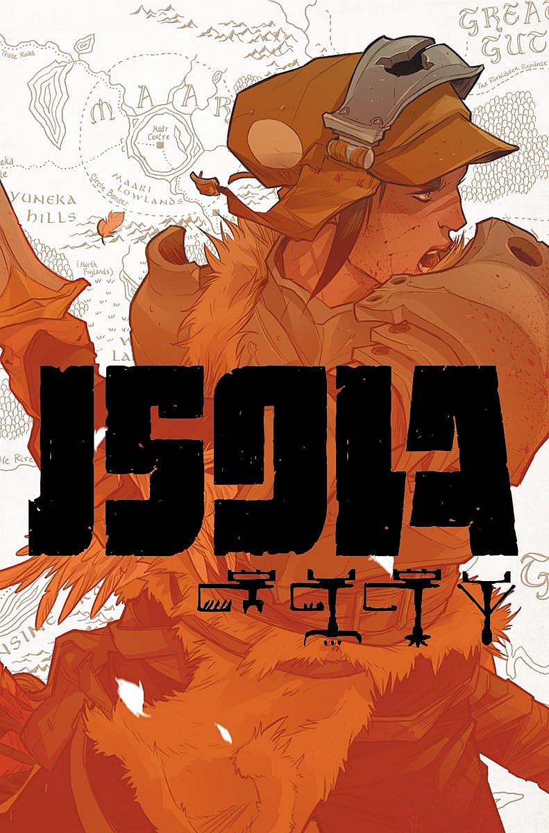
Isola #1 by Brenden Fletcher and Karl Kerschl tells the story of a mysterious soldier and her queen who has somehow been shapeshifted into a black tiger with teal stripes. They are exiles of their kingdom and are on a journey to Isola to fix their problems.
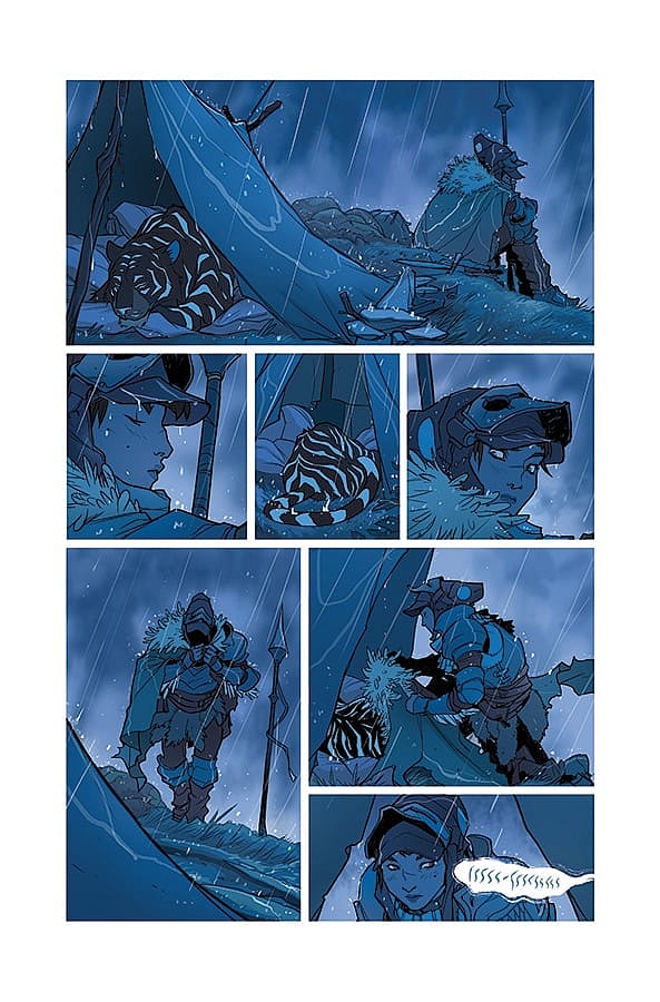
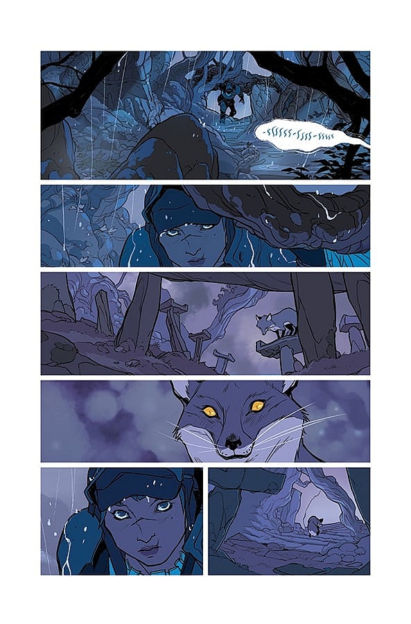
The beginning of the issue is a little bit tricky for a first issue. It’s hard to tell whether it’s a dream sequence, a premonition, or something else altogether. While it might be a little tricky to determine what it is, it absolutely draws you into the lush, beautiful world. There is absolutely no dialogue or exposition for almost four pages. We are just taken on a journey with a young soldier as we discover what her greatest fear is. The scene was very reminiscent of the cave scene with Luke Skywalker from The Empire Strikes Back. While there isn’t a lot of dialogue, the emotional fear of the soldier and her fear allows you to really connect with her and almost instantly empathize with her.
From there, the story explores the relationship the soldier has with her queen, the black tiger. Not only does she fear for her queen, but she cares deeply about her, and is extremely devoted to her. It really shows us the core of this soldier character.
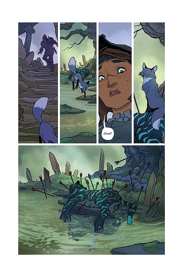
We also get to learn more about the queen, Olwyn, and her own difficulties. Being a tiger, Queen Olwyn does not speak. So a lot of what we learn about her is purely through Karl Kerschl’s artwork as well as a few lines of dialogue from the soldier, who we eventually learn is named Rook. We understand a little bit of her desires as well as the troubles she faces having recently become a tiger.
The pacing of the story is absolutely excellent. There aren’t any slow parts. In fact, just when you think it might be slowing down, Fletcher and Kerschl will throw in a twist. They do this a number of times to different effect. It could be to create suspense, create a sense of danger, or pique your curiosity.
Maybe the best part of this book is Karl Kerschl’s artwork. It’s absolutely gorgeous. He creates a lush and vibrant world. It gives off vibes of Avatar. If you didn’t know this is a different world you might even think it was connected to Nickelodeon’s Avatar. His panel layouts are rather standard, but he uses them to great effect. He builds up to major events with four thin horizontal panels on top with a large rectangle payoff panel on the bottom. As far as his creativity with monster designs there is a hint of it. We see a giant dead feathered creature. It’s hard to tell exactly what it looks like alive, but it’s absolutely enormous as we see Hook venture into its carcass.
The colors by Msassyk bring Kerschl’s art to life. The beginning of the book uses a much darker color palette to capture the fear within Hook. But as the fear sequence ends we get a bright sunrise, clearly showing a shift in the tone. We would see this darker tone return when Hook and Olwyn would find themselves in danger later in the book. But probably my favorite effect, is the use of a red shade to show us a first person point of view when Hook looks through an eyeglass to scope out the territory. The shading really makes you feel as if you are looking through the eyeglass.
The Verdict
Isola #1 is a stand-out issue. Brenden Fletcher and Karl Kerschl introduce us to a rich world with interesting characters who have quite a bit of depth to them. There’s also quite a bit of mystery to discovery. As the issue comes to a close you are left wondering what happened to Olwyn, who are the hunters, and who is this mysterious shaman like character. It definitely makes me want to pick up the second issue to find out more about these characters and this world. The way the book is written and drawn is almost cinematic. You can almost see the action in motion as you flip through the pages. I definitely recommend you check out Isola #1.


