Concept Art Depicts A Way Different MonsterVerse Design for Godzilla
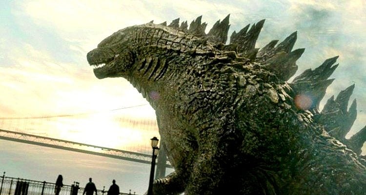
Godzilla’s appearance in the MonsterVerse, debuting in the 2014 feature directed by Gareth Edwards, blends what’s good about the old with some real-life practicality; and it only improved in King of the Monsters.
Toho being so picky about the look of their creation, especially after 1998, kept the design of Legendary Goji in line with their expectations which should indicate the concept artists under the supervision of Edwards resisted the temptation to go nuts.

Related — Godzilla: The 10 Titans We Want to See Next in the MonsterVerse And How They Get There
Well, it probably won’t surprise you to learn otherwise. Concept artwork from pre-2014 resurfaced and was shared by G-Fan Twitter account Madison Russell.
“The Godzilla 2014 concept art ranges really all over the place,” says their post. “From a very reptilian, dinosaur ask design, to just straight up classic Toho Godzilla.”
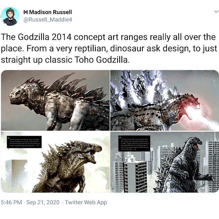
At least they were smart enough to consider the classic Showa/Heisei Goji, despite not going with it. Each image comes with a commentary by Edwards explaining why the given design wouldn’t work.
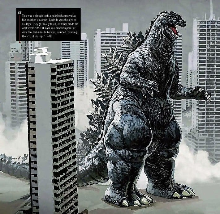
“This was a classic look, and it had some value,” said Edwards of the old Gojira. “But another issue with Godzilla was the size of his legs.”
He further explained, “They got really thick, and that made his walk cycle difficult from an animation point of view. So last-minute tweaks included reducing the size of his legs.”
From there, they went crazy. The legs got smaller, arms got shorter, and the dorsal plates got huge for this next design. Their inspiration? A Christmas tree – kinda.
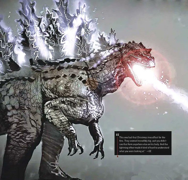
Edwards explains: “This one had that Christmas tree effect for the fins. They seemed incredibly big, and you didn’t see that form anywhere else on his body.”
He continued, “And the lightning effect made it kind of hard to understand what you were looking at.” Therefore, the above was struck and good thing too. It’s too Spinosaurus to be a Godzilla.
And speaking of dinosaurs, the next example goes full T-Rex but bears some resemblance to what we ultimately got. Still, it came with its own complications.
The greatest was its hodgepodge of influences, as Edwards described, cobbled together into a cut-and-paste monster.
Related: Concept Art Shows What King Ghidorah and Rodan Almost Looked Like in the MonsterVerse
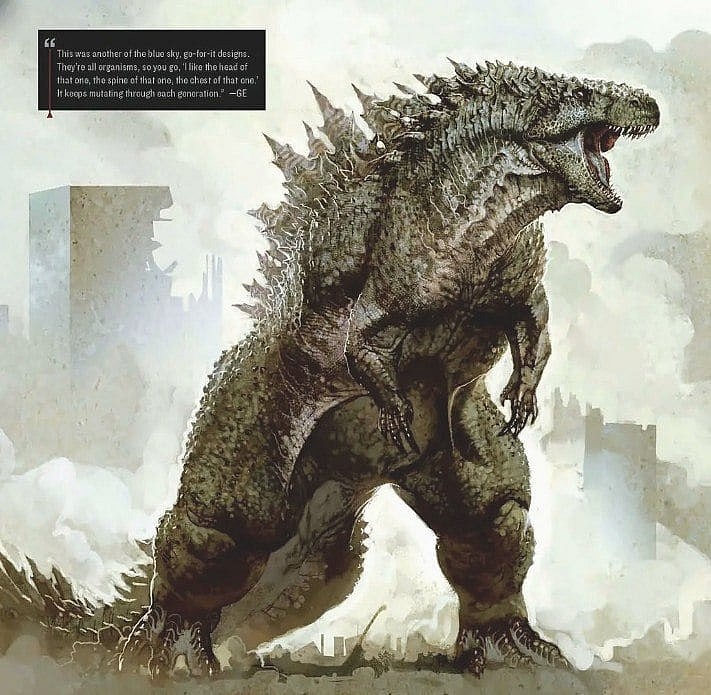
“This was another of the blue sky, go-for-it designs,” edified the director. “They’re all organisms so you go ‘I like the head of this one, the spine of that one, the chest of that one.’ It keeps mutating through each generation.”
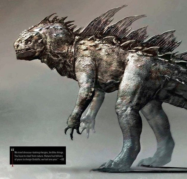
So the MonsterVerse Godzilla evolved from that one in a way despite its legs having the same thickness issue. They fixed the problem with this last one while going off the rails in every other respect.
The design has real-world properties, the authentic-looking reptile hide, for instance. The problem is nothing about what you find below evokes that classic Gojira look.
Related: Fan Art Gives Godzilla 2000 a Nightmarish Shin Upgrade
Edwards spell out what they were thinking. “We tried dinosaur-looking designs, birdlike things,” he revealed. “You have to steal from nature.”
He continued, divulging his timetable to come up with something. “Nature had billions of years to design Godzilla, we had one year,” he said.
Nature, or no nature, what they came up with there is flawed. And, if it reminds you of anything, Edwards’ final “dinosaur-looking” thing comes closer to 1998’s Zilla design (so maligned by fans and Toho) than anything else.

Having been there already, unable to change it then, it’s easy to see why Toho didn’t go with the two-legged giant marine iguana.
Of the four designs Edwards had in mind, “Madison Russell” prefers the classic, writing, “I don’t hate the design we got in any way… But…I would’ve loved to see how the movies would look with this design.”

Which one is your favorite? Do you like the MonsterVerse design thus far? Tell us below.
