‘Goddess Of Victory: Nikke’ Art Director Says Key To Sexy Character Design Is “Personality”, Not “Explicit Exposure”
Speaking as one of the video game industry’s veritable experts on the matter, Goddess of Victory: Nikke Art Director Hyung-seop ‘Hyulla’ Kim believes the difference between a sexy character, in particular women, being well-received or written off as fan service lies in whether they were designed for “personality” or “exposure”.
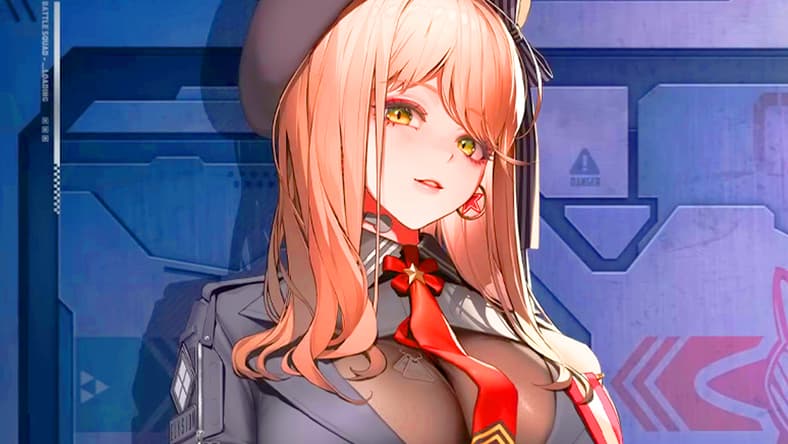
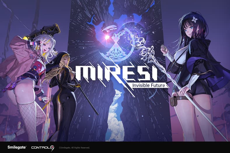
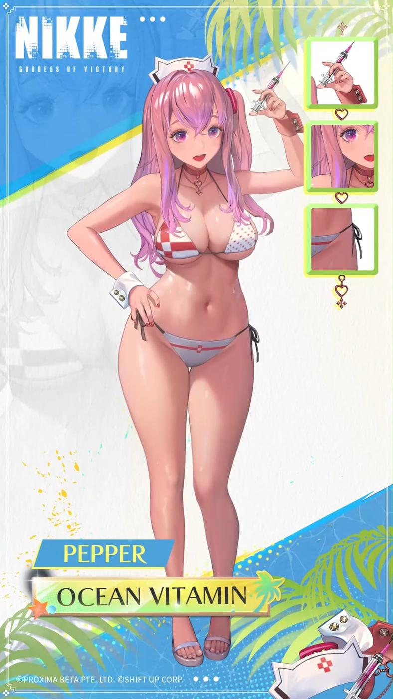
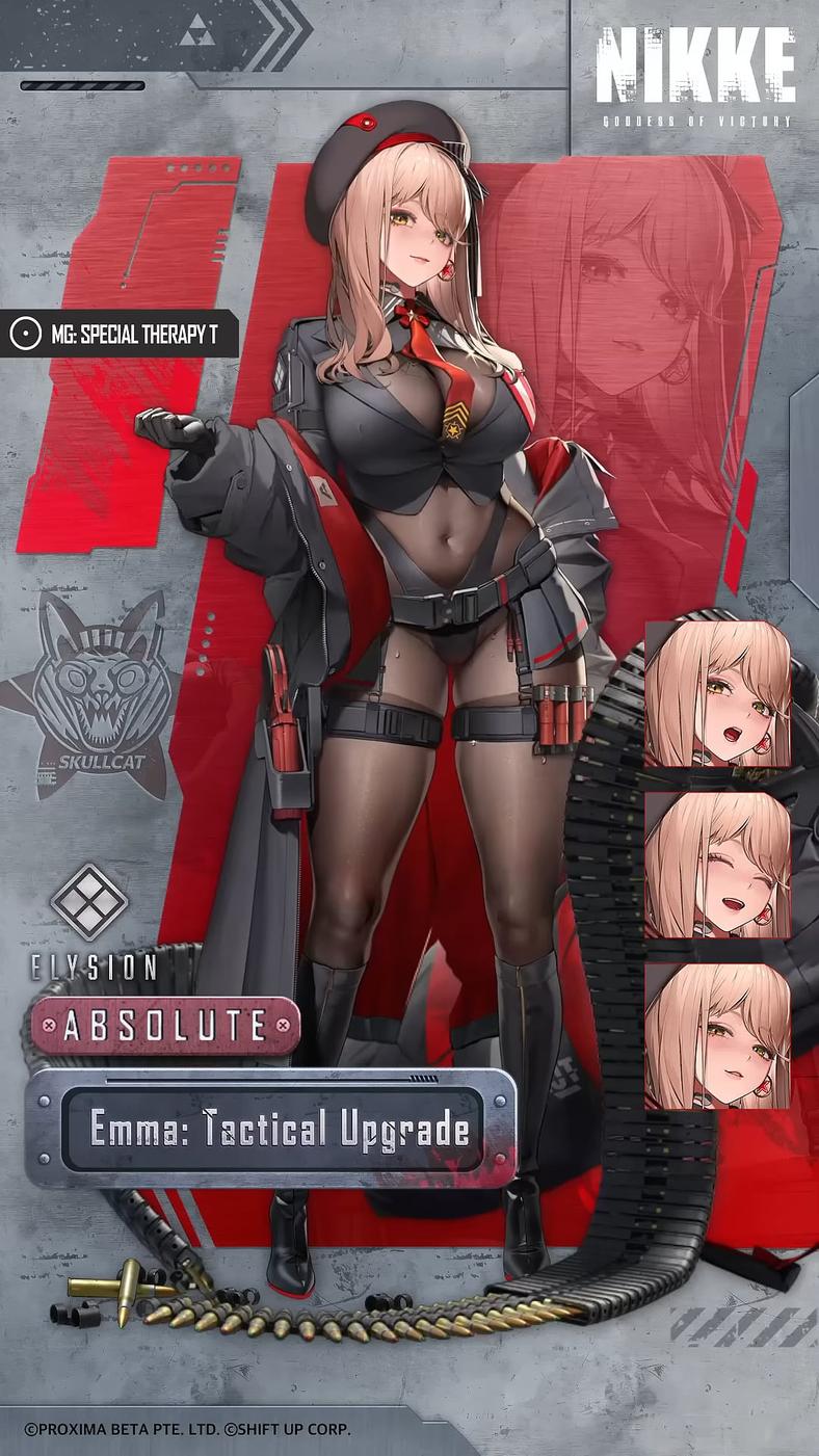
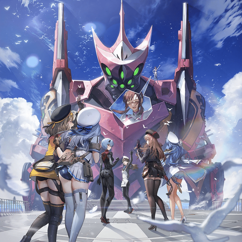
A founding member of the gacha game’s core art direction team and the creator of such notable Nikkes as Neon, Emma, Rapi, and Pepper, Hyulla shared his thoughts regarding risqué character design during a recent interview given to Japanese video game news outlet DenFaminico Gamer regarding his role as lead Art Director for Korean video game publisher Smilegate’s upcoming collectible-based, RPG rouge-lite, MIRESI: Invisible Future.
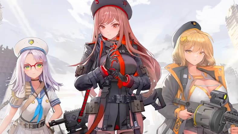
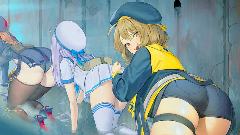
Met with an opening inquiry as to the origins his noted love of women’s thighs, itself a very prominent focus of his personal style (just look at his designs for Nikke‘s Neon, Emma, and Pepper), Hyulla recalled how, coincidentally enough, it was actually Shift Up director Hyung-tae Kim who lit the leggy fire in his heart.
As machine translated by DeepL:
“My memory is a bit hazy, but I think it was in my late teens. I had the chance to see the artbook for [now defunct Korean developer softmax’s 2000 RPG The War Of Genesis III PART.2, which featured character designs by Hyung-tae Kim.
And there, how should I put it… I was profoundly struck by the realization that ‘the female form can be expressed like this too.’ Since then, I’ve been fascinated by the representation of the female body and began studying it seriously.”
To this end, Hyulla then explained that his specific tastes could be be referred to by the Korean term ‘tongtongham’ [통통함], which “refers to a body that’s ‘nicely fleshed out, voluminous, and attractive.’
“Fundamentally, I think they’re understood as nearly synonymous. If there’s a slight difference in nuance, it might be that preferences for [tongtongham] vary depending on the specific form people like.
“For example, some people prefer a form where the entire body has a well-balanced amount of flesh, while others prefer a form where only the abdominal area has a good amount of flesh.
“In my case, I prefer a style where ‘the flesh is where it should be, yet the rest is toned and firm.’ The contrast between thick, sturdy thighs and legs that taper gracefully emphasizes the sensuality. This is something I also prioritize when drawing illustrations.
“One thing I remember is that while drawing, the thigh silhouettes naturally became thicker. The moment I saw that, I was struck by the thought, ‘This is actually really good…'”
“But drawing thicker thighs was completely opposite to the values I’d learned up to that point—that ‘slender styles are cute.’
“In my late teens, I went through a period of conflict. The general perception was that a delicate, slender style was beautiful, so I struggled with whether I should adhere to that or accept my own instincts.
“Ultimately, I chose to embrace my instincts. I think it’s pretty obvious if you look at my illustrations now.
“I myself absolutely don’t dislike slender thighs. I love them all—slender thighs, thick thighs, average thighs—regardless of their form.
But, purely speaking from my personal perspective, thin thighs tend to satisfy me just by looking at them.
Conversely, thick thighs offer not only visual satisfaction but also spark imagination about their texture—like ‘they look soft’ or ‘they feel squishy.’ That, I believe, is the very essence of [tongtongham] and the charm of thick thighs.”
Following a brief discussion regarding his artistic influences, Hyulla was asked for insight into his specific character design process, to which he explained that he began by drawing inspiration from a given character’s personality, rather than just their physical qualities:
“Approaches vary, but we start by identifying the key elements to emphasize for that particular character—whether its ‘background (inner world)’ is crucial, or if its ‘abilities’ stand out.
“For example, with a flower-themed character, how that flower is incorporated into the costume and hairstyle becomes crucial.
“Above all, I believe it’s vital to design every aspect—from the shape of the eyes, nose, and mouth, to each body part, clothing, and accessories—to ensure the character’s defining traits are clearly expressed.”
From there pressed as to whether “the beautiful female characters, and that the boldness of their outfits is a selling point” for MIRESI“, Hyulla clarified that while the cast’s ‘sexiness’ was definitely a point of consideration, he aimed to communicate it not outright, but rather in a specifically subtle way:
“Given the overall game policy and certain adult considerations, some characters have more revealing outfits while others have less.
Personally, though, I don’t want to resort to overtly explicit exposure. Instead, I aim for a direction that ‘stimulates fetishism.'”
Raising the design for MIRESI‘s Tieria as an example, he then detailed:
“While some parts are quite revealing, the overall exposure is actually restrained. This is the result of considering her timid personality and consciously applying a ‘cover what needs to be covered’ approach to her revealing style.
“Even if a character wears an outfit that reveals a lot of skin, if the design is reminiscent of the character’s personality first, users will fall in love with the character first, rather than the exposure, and then notice the exposure element. I believe this order constitutes ‘good exposure’ that isn’t too explicit.”
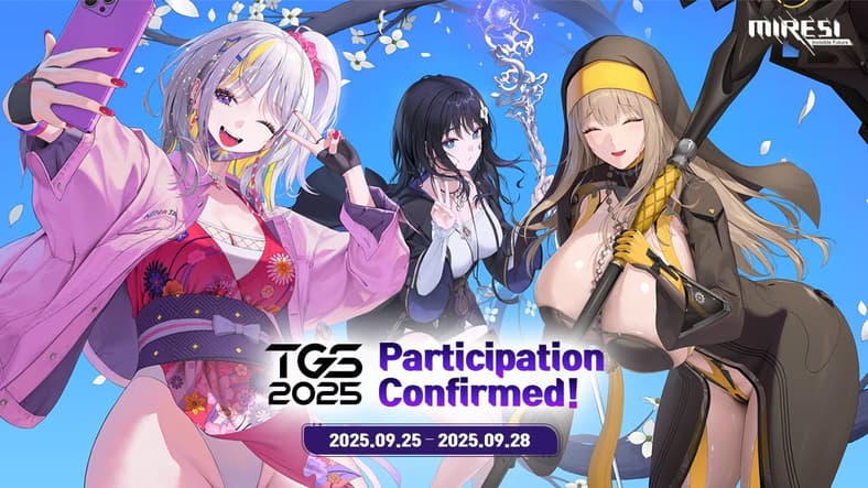
At present, MIRESI: Invisible Future has yet to receive an official release date.
Meanwhile, more information regarding the game will be released late this month during the Tokyo Game Show 2025, as set to be held from September 25th – 28th.