Comic Book Review: Tomb Raider #1

While Lara Croft is on a break from adventuring, she is dragged into a whole new adventure concerning the Mushroom of Immortality. What troubles will she encounter? How does it fare?
[easyazon_image align=”center” height=”500″ identifier=”B01AXFEYVM” locale=”US” src=”http://boundingintocomics.com/wp-content/uploads/2016/02/51KZaOBou4L.jpg” tag=”bounintocomi-20″ width=”329″]
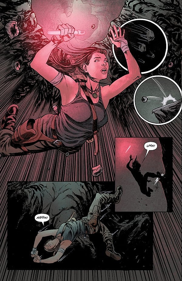
[easyazon_link identifier=”B01AXFEYVM” locale=”US” tag=”bounintocomi-20″]Tomb Raider #1[/easyazon_link] has an exciting start. Mariko Tamaki and Phillip Sevy put us right in the action with Lara evading danger only to find herself in a potentially more dangerous situation. It’s exciting and gets your blood pumping. You want to know what mission she is on, what she’s after, and who is after her. It’s a fantastic hook.
However, the book takes an abrupt turn on page four, taking us back a week earlier. This is where we will stay for the rest of the book. In addition, the tone of the book shifted dramatically with respect to the art, especially the coloring. No longer are there lines streaking down the page depicting motion and action. The dark coloring of the hook sequence is replaced by the brightness of a commercial bathroom. The ensuing dialogue makes us yearn for the darkness and the action that took place in the beginning of the book. It is bland and boring. Imagine sitting in a stuffy lecture hall where the professor has a the most monotone voice you can imagine. That’s pretty much what this scene is and the dialogue captures it perfectly.
While the dialogue captures the monotone nature of a stuffy, boring classroom, it is clunky and a lot of it seems superfluous. For example, Lara’s friend goes on about shopping malls for an entire page. There really isn’t much characterization either. We don’t learn anything about Lara Croft; Tamaki assumes the reader already knows who she is. This problem is further exacerbated when she fails to even tell us the name of Lara’s friend.
The dialogue isn’t the worst part of this book; the overall story is lacking. There is an entire training sequence put into the book purely to entertain the idea that Lara Croft can hear really well. There are a full seven pages focused on this one ability. It’s a little overkill, especially when a simple line of dialogue or exposition would have sufficed.
The training scene is also the only real action sequence aside from the opening scene. The combat sequences are decent, but Phillip Sevy and colorist Michael Atiyeh fail in their attempts to depict Lara’s trainer, Dana’s sight. Dana happens to be going blind and they attempt to show her vision through black and white panels juxtaposed to colored panels. Where the idea goes wrong is the black and white ones aren’t from Dana’s point of view; instead, they are from a third person view so it appears that the third person or you as the reader are the one having the sight problem.
Getting back to the story, there are times where scenes feel a little out of place. An assistant randomly confronts Lara outside of her apartment building. It doesn’t fit into the narrative flow and seems like a forced encounter. It would have been much more logical to have the assistant confront her as she was leaving the conference. The story does improve in the last quarter of the book setting Lara on a mission and teasing the villains.
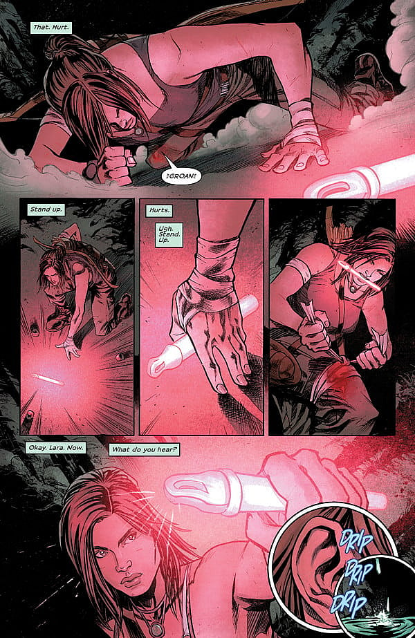
Phillip Sevy does a great job incorporating Lara’s enhanced hearing and he does it from the get go. He uses circular inset panels to portray what Lara is hearing, whether it is boots scuffling on the ground or tiny pebbles falling off a cliff. He makes it abundantly clear it is her hearing by depicting a close-up of her ear in the first of these panels. It’s a great way to capture a sense that isn’t usually stimulated when reading a comic. He does play with the circular panels as some of them aren’t specific sounds Lara is hearing and sometimes he even depicts Lara within them.
One eyesore occurs on the fourth page and, to make matters worse, Sevy practically fills the page with the eyesore by blowing up a small sign in a larger panel below it. The problem is the sign looks absolutely terrible and obviously wasn’t done as part of the page, but more than likely by the letterer after the fact. It looks out of place and doesn’t fit with the style of Sevy’s art.
Sevy struggles with architectural structures; they are too cookie cutter and perfect. An old diner barely has any wear or tear to it and the steps look too geometric. It looks like his buildings are geometric shapes put together. It makes the city feel stale. He does seem to recognize this problem as he moves throughout the issue and adds in more shadowing to give the city some character. There are also minor continuity problems such as the number of steps at the diner’s entrance. We first see about six, but later on it is reduced to three.
The Verdict
[easyazon_link identifier=”B01AXFEYVM” locale=”US” tag=”bounintocomi-20″]Tomb Raider #1[/easyazon_link] has an excellent opening hook, but the book falters mightily and only barely recovers towards the end. The dialogue is choppy and much of it seems superfluous. Key characters aren’t introduced and it is assumed the reader knows who they are. The art has too many mistakes from continuity issues to a stale cityscape. The opening hook and the end do give the series promise, but so far it is unfulfilled.


