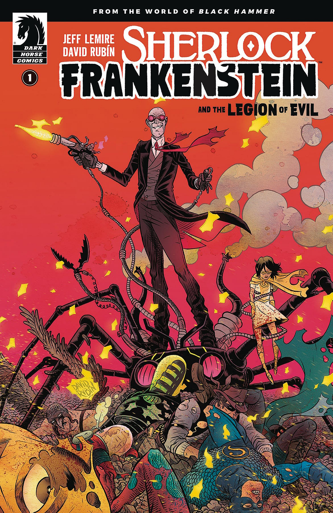
Comic Book Review: Sherlock Frankenstein and The Legion of Evil #1

There’s something to be said of a comic that takes in to account the realities of a character’s situation. In the case of Sherlock Frankenstein and The Legion of Evil, we are exposed to that bit of realism in the world of fantasy.
This title follows the path of Lucy Weber, the child left behind by Black Hammer. It recounts her tale and her efforts before landing on the Black Hammer farm, where lost heroes Abraham Slam, Golden Gail, Barbalien, Madame Dragonfly, Colonel Weird, and Talky-Walky have been trapped.
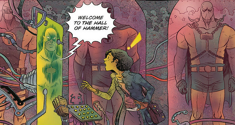
The story picks up where it left off in Black Hammer #12 where Lucy finds the Hall of Hammer as a last effort by her father to tell her to leave him behind. She intends to find out what happened to him and the other heroes who disappeared in a battle with the Anti-God almost a decade prior. She decides her first step is to locate her father’s greatest villain, Sherlock Frankenstein. Her search leads her to a den of villains, and a lockup for some of the most powerful monsters the world has ever faced.
What I failed to consider in my review of the last chapter of Black Hammer #12, is the situation of Joseph Weber, a.k.a. The Black Hammer. His life was filled with battling villains and monsters and trying to hold down a family life. When I criticized the layout of the Hall of Hammer, I never once tried to think about how Jeff Lemire wanted to integrate realism into everything his characters did. So, what kind of schedule would someone with a hectic monster/villain fighting schedule with a wife and kid have? What free time would this hero have to polish up his sanctuary with the latest tech and streamline it to look aesthetically pleasing? None at all, it seems. Hell, my work station at home is a mishmash of wires and monitors just as much as his was. Yet, it works.
I believe that’s all that Jeff Lemire wanted readers to understand of Joseph Weber. He doesn’t have a flashy facility equipped with gadgets galore. It is little more than a broom closet with some monitors and cases that hold some previous suits. And it was something he worked on in what little spare time he had.
And the Hall of Hammer was something he eventually wanted his child to see.
That’s essentially what those late night, at the end of the day passion projects are. They aren’t perfect. They aren’t as polished as you’d want them to be. But they are something that you hope to pass on to the next generation. It’s just you’re so caught up in now that you forget about what comes afterward. Again, Lemire setting up the story to highlight both actions and consequences.
So let’s talk about David Rubin’s art again.
I made a comparison to Dean Ormston’s style, stating it looked less polished. He had a way of distorting people to make them look uncomfortable. It made people hard to look at, and added to that the color scheme just didn’t appeal to me aesthetically.
Yet in my haste, I failed to consider the larger picture of what Lemire wanted Rubin to convey. Maybe he isn’t going for aesthetically pleasing. This is the life of a hero, and the ugliness of what that life leaves behind. Yes, it is an ugly world. Not ugly to the point of being interesting for being unique, but ugly to the point of uncomfortableness. And the entirety of the chapter left me feeling that way. Even though that ugliness and uncomfortableness didn’t work for how Rubin presented his human characters, it certainly worked for how he is presenting the monsters and villains.
With that said, I think that the art style may still turn a lot of people off. Just as it did with the last chapter of Black Hammer, the art aesthetic is the first thing that draws your eyes to a comic. If that somehow doesn’t jive with readers, it’ll be hard to pull them in for a riveting story. And the story is indeed riveting. And it did pull me in.
The Verdict
Lemire continues to bring a story of consequence in Sherlock Frankenstein and The Legion of Evil #1 to the readers. Here, I think David Rubin’s art tends to shine. The monsters and robotic villains are intimidating. Rubin’s style of warped and distorted actually work well in drawing monsters, making them almost otherworldly. The story of Lucy’s search builds a certain amount of tension and intensity as she gets closer to the truth of Sherlock Frankenstein’s whereabouts. The art style, though seemingly off-putting, builds upon that tension and intensity to make the reader feel as uncomfortable as the environment conveys.


