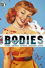
Review: Bodies #1

Bodies explores four detectives investigating four murders in four different time periods with each time period having its own artist! The only thing connecting each of the four different story lines, the same murdered body in the same location, Long Harvest Lane, London. And of course the number four.
Writer Si Spencer starts the reader off with the familiar, dropping them in modern day London in the middle of a large protest being broken up by the police. The dialogue is fun and even flirtatious in some parts; Spencer uses it to make some political commentary on immigration, minority issues especially in regards to the Muslim community, and police brutality. Meghan Hetrick artwork does a good job of representing the time frame, it is realistic although D.S. Hasan’s hijab did not clearly portray it was a hijab, this might have been the fact she is a detective in riot gear bashing demonstrators skulls in.
Spencer switches from the modern era to the late 19th century where the reader meets Inspector Hillinghead; where again Spencer touches on a hot-button political issue. Spencer reveals more about the dead body specifically the types of wounds it has sustained. Artist Dean Ormston makes the world believable using the shadowing of blacks and greys effectively. Ormston also exposes the reader to Inspector Hillinghead’s crime photos with close-ups of the hand and face. However, Spencer creates a little bit of intrigue and mystery when the Inspector’s co-workers, apparent members of the Order of Mithras, discuss a beginning.
Following the mysterious meeting, Spencer cranks up the extremely weird in jumping into the future to 2050 to meet Detective Maplewood. London has changed in the 30 plus years since D.S. Hasan’s time and something known as the pulsewave affects the detective’s short-term memory. The dialogue seems to be an attempt at humor, but it came off as very strange. The strangeness doesn’t stop with Maplewood’s external dialogue with herself, but gets amped way up and brings back memories of the Shining. Tulo Lotay does a good job of capturing the horror imagery from the streaks on the wall to the shape of the puddle underneath the girl’s feet. However, Lotay’s artwork doesn’t inspire hope for the future, Long Harvest Lane looks abandoned and barren with the buildings crumbling apart. The rough shadow lines cast a bleak outlook. The biggest gripe is the body does not have the same feel or look in the previous two time frames. Lee Loughridge does a great job with his bright greens and yellows to display the face that the time frame is in the future.
Spencer moves to the final detective in Inspector Charles Whiteman, who looks more like an Al Capone gangster than a police detective. Spencer uses Phil Winslade’s artwork to a tee making an overt reference to police brutality, this time the brutality isn’t whacking a protestor with a billy club, but using a blow torch in some creative ways. Winslade’s art evokes noir from the cobblestone streets to the policeman’s helmet. Spencer brings the book full circle leaving the reader with a dead body, having us wonder who they are and what happened to them?
|
7.7
|
An inventive story filled with political commentary, intrigue, and at times the strange that is setback by mixed levels of artwork.
|

